 EVALUATION ACTIVITY 1: in what way does your media product use, develop or challenge forms and conventions of real media products?
In filming my media product I have tried to challenge film forms and conventions, as well as sticking by them. Since I am filming a horror/comedy it is important I stuck to some of the conventions of the horror genre in order to be able to mock them.
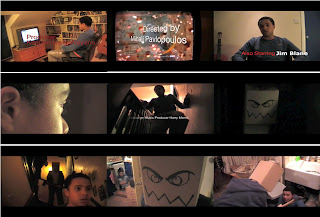
Firstly, I should talk about the title of my film "Boxed In". I chose this title wholly on the appearance of the murderer, who wears a cardboard box on his head. It is a play on words, the definition being “enclosed in or as if in a box”. To feel boxed in is to feel trapped, as in when the murderer corners his victim at the end of my clip. Yet the murderer himself is also technically boxed in, since he has a box on his head. The name of this film is rather like “Scream”, since the title is connected to what the murderer makes his victim do. Yet the mask the murderer in “Scream” wears is also screaming.
I chose to have the scene set in the victim’s house because, as with a lot of horror films, the directors often choose to have the victim attacked where they feel most comfortable and secure, i.e. in their own house. I feel that this adds to the horror of the situation. But there is also a sense of insecurity when you’re in a house alone, especially when its dark and you can’t see much. Again this setting is same the opening scene in “Scream”. It is also used in the spoof of Scream: “Scary Movie”. Both sequences work effectively on the concept of fear when alone in your house. I have introduced the “victim” when he is playing his computer game, comfortable and happy. His surroundings and actions show us he is a typical teenager and there is no apparent threat. The appearance of the murderer in the dark doorway, is then a shock, all the more so because he is hard to see.
Where I hope my film differs from “Scream” and “Scary Movie” is in the initial ambiguity as to who is the victim. I chose to have the “victim” play a popular and very violent computer game and included close ups of his kills. This is intended to introduce some doubt in the mind of the viewer as to whether he or she is watching the murderer or his victim.
When thinking about what costume the murderer should wear, I had a look at popular horror figures such as Jason, Michael Myers, Ghost Face and Leather Face, all of whom wear masks that look scary and cover their identity. I thought I could use a mask to my advantage to add comic value to my film. I chose a cardboard box with a face drawn on it because it follows the conventions of using a mask in horror films but it makes a serious and frightening situation, like the arrival of a murderer, seem a little more funny and light hearted. The fact, for example, that the murderer appears to have forgotten to cut eye holes in his box adds to the comic value the mask. More subtly the box is also a symbol of the job the murderer does, and which has led him to receive the abuse that has ultimately turned him into a murderer.
When filming I tried to include an interesting array of shots and movement in my camera work. I felt it important for the camera not to stay stationary, that is why I included the pan in the beginning and the Constantia shot at the end. The camera in “Scream” follows the victim around the place, giving us the feeling she is being watched. I also feel changing camera angles and movement helps generate a feeling of anxiety and imminent threat in the minds of the viewers.
During the editing process, I tried make the scene sharp and snappy, not hesitant as is so often the case in other horror films. I felt that a quick pace is better suited a comedy, slapstick if you will. I didn’t like, for example, how the title sequence of “Scream” drags on rather.
I kept fonts of the titles quite simple, so it could be easily read, but the way they come onto the screen is quite stylistic. They tend to exit due to the characters’ movement. The colours of the titles are white, black and red because I felt when together they can be somewhat menacing: red having connotations of blood and anger, black having connotations of death and white balancing the two out, but also being the colour of a shroud.
I tried to make the title sequence not give too much away about the rest of film. The audience gets introduced to the murderer and see him kill someone. They don’t how many he has killed and why but they are introduced to the threat. Most horror movies start with a murder. It’s a good way to get the audience scared and ready for the rest of the film.
The genre of my film is comedy/horror so I had to get the right balance of the two. The comedy in this scene consists of the murderer having a box on his head, the slapstick when he walks in to the wall, the swing of the axe around to Benny Benassi and the over dramatic acting by the victim. Basically I have taken the horror genre and exaggerated it. However, I have more subtle humour than “Scary Movie”, and hopefully haven’t over done it. There is nothing worse than unremitting gags that get less and less funny the more there are of them. I would almost go as far as to say the title sequence in my film is more scary than funny. In this way the humour has more impact when it does occur. I think subtle humour can be more effective than bold, when done well.
EVALUATION ACTIVITY 2: How does your media product represent particular social groups?

Effectively there are two social groups in my film. The first is the dominant, socially acceptable group – the teenage victims. They are reasonably affluent, wear the clothes of the day and do the things normal teenagers do. The use of the computer game ‘Call of Duty’ is a quick motif that most teenagers will relate to. The teenage victim in the opening shot is also wearing ‘Abercrombie and Fitch’ – a popular clothing brand among teenagers.
The second social group is the disaffected elderly population, as represented by the murderer. He is working class, unlikely to have been well educated given the job he does (stacking shelves in a supermarket). He is old and out of luck. He has had a life time of verbal and possibly physical abuse from young people better off than him, but with little moral sensitivity or empathy. He recognises the unfairness of the situation and finally decides to act and reek vengeance on those more fortunate than him, who have lorded it over him for far too long.
Where my film differs from others in this genre, is that I am trying in the story line to encourage viewers to have some sympathy for the murderer, not just hate and fear him because of what he does in the film. By the end of the film I would at least hope viewers would understand, and to some expect sympathise with, the murderer’s motives for murder.
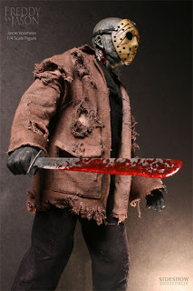
In this respect the murderer in my film is similar to Jason Voorhees from ‘Friday the 13th. Like my character he has been seen as a sympathetic character, although one whose motivation for killing has been seen as driven by the immoral actions of his victims. He also wears the cult mask that you see so many horror figures wearing in films. Their whole attire is pretty similar, they both wear dark concealing clothes to scare and to hide their identity from their victims.
EVALUATION ACTIVITY 3: What kind of media it institution might distribute your media product and why?
EVALUATION ACTIVITY4: Who would be the audience for your media product?
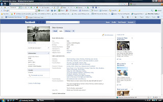 Here is the link to a Facebook of someone i think would watch my film, the target audience if you like.
As you can see he is very much in to horror films. Those who are into horror are a good target audience because a comic version of their favourite genre will be an attraction to them. He is also a outgoing, active guy who likes a laugh, I'm sure a high octane, gory, comedy horror will match his taste.The music he likes also matches that of what would be included in the film.
The fact Dan is a pretty stereotypical teenager like the on in "Boxed In" means he can relate a bit more to the films protagonists (who are teenagers), maybe even making the experience a bit more personal and scary.
EVALUATION ACTIVITY 5: How did you attract/address your audience?
EVALUATION ACTIVITY 6: What have you learnt from the process of constructing this product?
FILMING:
JVC Everio HDD hard disk camcorder
I used this camera to film my title sequence becuase i felt it produce a good quality, clear footage.
Tri-pod
I used this to keep my footage still and prevent the shake i would get from using my hands.EDITING:
Mac Book
I used this because it had the editing equipment I wanted and is fast and easy to use.
IMovie
I used this because i felt was the easiest to use that also gave a smooth and clean finish.
EVALUATION ACTIVITY 7: Looking back at your preliminary task, what do you feel you have learnt in the progression from it to full product?
I feel my camera work and editing has improved greatly since my Preliminary task. I have taken what I have learnt from practicing with the 180 degree rule, match on action and shot/ reverse shot and included it in my film where needed and added a variety of other shots and angles. I have had a chance to improve my editing skills with this new film, using a few techniques that I didn’t use in my preliminary task.
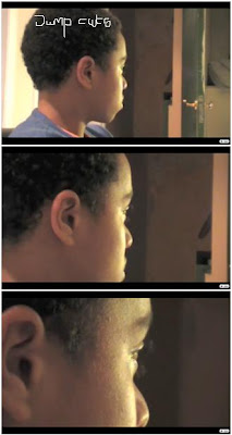
The jump cuts here that I have used are a good example of where I have improved. I used editing to create fast and jumpy cuts in to the teenagers face. This makes the scene less static and adds suspense.
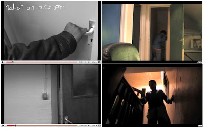 I used match on action in my title sequence as well as my preliminary task. I made sure, using IMovies Precision Editor, it was as accurate possible.
I didn’t use the 180 degree rule in my title sequence because I felt it was not needed and that none of the scenes would end up confusing the audience. I also didn’t use shot/ reverse shot because there is no dialogue in my title sequence hence it would not be relevant.
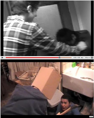
Here is a good example of where I have taken what I have learnt in my preliminary task and used it in my title sequence. I liked how the high over the shoulder shot portrayed the dominant character.


No comments:
Post a Comment